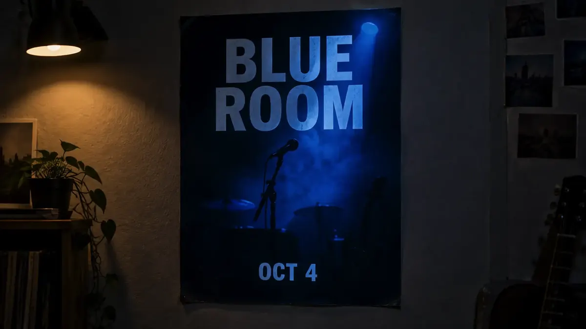
AI Poster Generator
Add your theme and headline, choose a style, and create a poster.
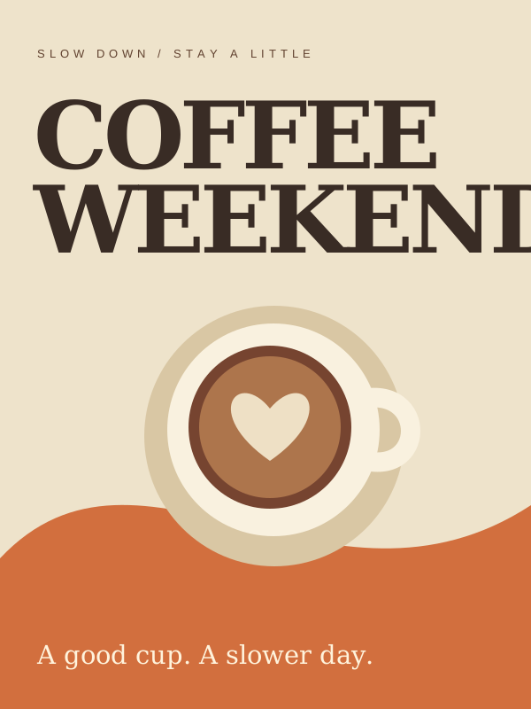
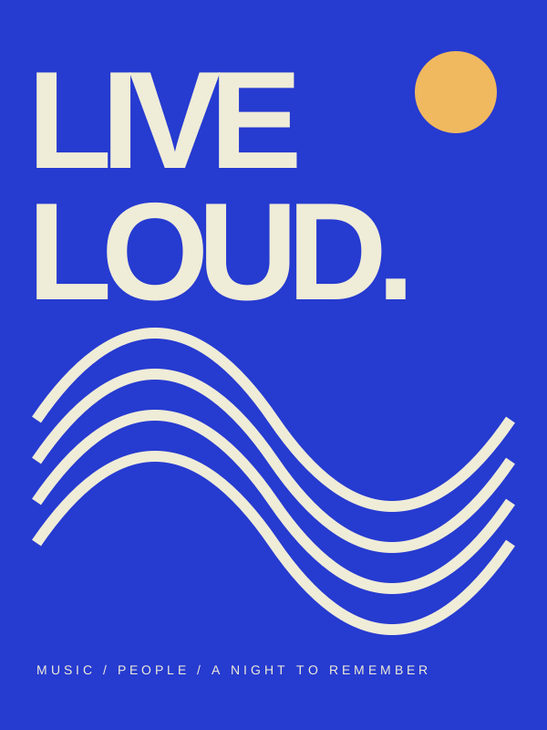
Describe your event or campaign and enter a headline in Ofrai's poster tool to generate a visual concept. To make a text-free background instead, edit the generated prompt before submitting. Check the selected model's credit estimate before generating. Review any headline in the result character by character; add or correct dates, URLs and other exact details in a design editor before publishing. For boxing face-offs use the fight poster page; for small-screen covers use the thumbnail generator.
Hierarchy: what the eye should hit first
A poster has one job per second of viewing: attract, orient, inform. Say the order explicitly. 'Bold title across the upper third, subject occupying the lower right, date line beneath the title' tells the model where weight belongs. Vague prompts like 'poster about a music night' produce balanced, inert images with no focal point. Give the hero element the largest area and the highest contrast, push secondary elements down in tone, and leave the third element out entirely. Most weak posters are competing for attention rather than missing decoration.
Title-safe areas across print and screen ratios
Match the printer’s trim ratio for print. A-series paper is approximately 1:√2. For screen layouts, use 4:5 for feed posts, 1:1 for square tiles, and 9:16 for stories or reels. Describe the open space as a named region: 'upper third left clear for a headline', 'bottom strip reserved for date and venue'. Leave at least ten percent margin so text never touches the trim.
If you need type in the final image, say 'large flat colour block with clear empty space' rather than 'space for text' — models fill 'space for text' with generated letters you will have to remove anyway.
Design language for events, gigs, and campaigns
Describe genre conventions, because that is what makes a poster read as a gig poster rather than a generic composition. Gig: 'high-contrast screen-printed gig poster, limited two-colour palette, heavy condensed sans-serif shapes implied as blocks, halftone texture'. Classical: 'minimal concert poster, generous white space, single photographic subject, fine serif lettering suggested as an empty band, muted ink colours'. Cyberpunk: 'neon on wet asphalt, magenta and cyan, rain haze, high contrast silhouettes'. Product campaign: 'clean studio object, single colour field, generous negative space, commercial lighting'.
Each of these is a set of production cues the model can act on.
Typography as a rendering problem
Modern image models can produce short, simple words reasonably, but they will not spell a date, a URL, or a sponsor list correctly. Plan around it. Option one: generate the poster with no type at all and set the text in Figma, Illustrator, or Canva afterwards — this is what most designers do and it is the reliable path. Option two: generate type as abstract blocks and treat it as texture.
Option three: if you need a real name on the image, keep it to one short word in a single style and check every render character by character before publishing.
Backgrounds, focal subjects, and creating depth
Posters need a background that supports the subject rather than competing. Useful moves: a large flat colour field, a subtle gradient, an out-of-focus photograph, or a geometric pattern at low contrast. Then give the subject separation: 'subject sharply lit against a soft blurred background', 'strong rim light separating the figure from the backdrop'. For product posters, describe the light rather than the surface — 'single hard light with a long shadow across the colour field' gives a poster its graphic punch.
A subject floating in a void reads as a mockup, not a poster.
Prompt recipes for three poster types
Gig: 'High-contrast screen-printed gig poster, limited black and hot pink palette, a singer silhouetted by a single hard spotlight, halftone texture, bold empty block across the upper third reserved for a headline, 2:3'. Classical: 'Minimal concert poster, generous warm-white space, a single cello in low side light, muted ink colours, fine empty band beneath the subject for lettering, 2:3'.
Product launch: 'Clean studio product poster, single amber colour field, a bottle with a long shadow cast across the field, generous negative space on the left, commercial lighting, 4:5'. Keep the palette sentence identical across a campaign.
Colour systems that hold a poster series together
A campaign needs its posters to look related without looking identical. Lock a palette sentence and reuse it verbatim, such as 'limited palette of three colours, deep navy background, bone white type block, one hot orange accent', then vary only composition between pieces. A series usually needs four or five variants with different subjects and the same colours and margins. If you want them tighter still, fix the background field and change only the focal subject and the halftone treatment.
Never regenerate a finished poster just to change the date; keep the frame and redo only the focal element so the palette does not drift.
Proofing the layout before you publish
Check three things before a poster goes live. Readability: shrink it to thumbnail size — if the title block is not the first thing you notice, the hierarchy failed. Safe area: text must clear the trim by at least ten percent, and social crops eat the top and bottom, so keep the headline in the middle band. Legibility at size: if a date is drawn into the image, verify every character, because generated lettering drifts between runs and an error is glaring at poster scale.
For print, generate at the largest available size and scale down; upscaling softness cannot be hidden by layout work.
Five poster prompts with the type area reserved
Every one of these reserves its headline zone explicitly, which is what makes them finishable in a design tool.
Gig: "high-contrast screen-printed gig poster, limited black and hot pink palette, a singer silhouetted by a hard spotlight, halftone dot texture, the entire upper third left as a flat clear block of colour for a headline, 2:3."
Classical concert: "minimal concert poster, large areas of warm white space, a single cello lit by low side light, restrained ink colours, subject low and right, the whole left column kept clear for typography, 2:3."
Product campaign: "launch poster for a skincare product, warm sand background, one bottle low and left, generous empty space above and to the right, soft daylight, subtle contact shadow, 4:5."
Exhibition: "museum exhibition poster, deep charcoal background, a single object centred in the lower third under one narrow spotlight, thin hairline frame, upper two-thirds left empty for a long title, 2:3."
Event with a date band: "community festival poster, three-colour palette of teal, cream, and warm red, flat geometric shapes, a band photo occupying the lower half, a clean horizontal band across the top kept free of detail for date and venue type, 3:2."
The reserved zone is named as a region of the frame, never as "space for text", which the model reliably fills.
Ratio, resolution, and export settings for posters
Poster settings are mostly about the file you hand off. Ratio: render at the final ratio — the printer’s trim ratio for print, 4:5 for feed, 9:16 for story — because resizing a finished composition moves your subject relative to the title block. Resolution: for print, aim for 300 pixels per inch at the final size, which for an A2 poster is about 4961 by 7016 pixels before bleed.
Overscan: render with a small margin beyond the trim line, because social platforms crop the edges unpredictably and you would rather crop than regenerate. Text zone: measure it — keep the headline zone at least ten percent inside every edge. And export flat PNG rather than JPEG: a poster is exactly the image type where JPEG compression artefacts appear first in the gradient behind the subject.
The handoff: what to generate and what to set yourself
The division of labour is simple and worth stating plainly. Generate the composition, the palette, the atmosphere, the focal subject, the tonal structure, and the empty type zone. Set yourself every glyph: the headline, the date, the venue, the URL, the sponsor list, and the credit block. This is not a limitation to work around — professional poster design works the same way, with artwork and type composed separately.
The practical workflow is to export a flat master with the type zone marked by convention (a flat block of colour works better than transparency, because it survives every tool), then open it in Figma, Illustrator, Canva, or InDesign and set type with a licensed family. A second export with the zone visible and the subject only is useful as a key visual for social.
What a six-poster campaign costs in credits
Campaigns are cheap in exploration and expensive in layout mistakes. Scout: twelve flux-2 frames across three compositions, because a composition that does not hold at thumbnail size should be rejected before you set any type. Lock: one gpt-image-2 frame per composition at final resolution, where the halftone, gradient, and focal separation are decided. Produce: six nano-banana-pro finals at final ratio and resolution. Roughly twenty-one renders for six finished poster backgrounds. On Ofrai they all draw from one credit balance.
The efficiency rule is to fix the palette sentence once per campaign and reuse it verbatim; posters fail in series because each one was written from scratch, which is the same mistake this site makes everywhere else.
How this differs from a thumbnail or a typographic layout
A thumbnail workflow optimises for click-through at very small sizes, which means one enormous face or object, extreme contrast, and no room for type at all — a poster and a thumbnail are opposites in that respect. A typographic layout workflow starts from the words, letting hierarchy and grid drive the composition; this page starts from the image and leaves the words to be set afterwards, which is the right order when the artwork is what carries the campaign.
If your brief is a headline-first announcement with minimal imagery, use a layout workflow and skip this page. If the brief is a visual campaign where the headline supports the artwork, generate here and set type in Figma — that division is why this workflow is worth a separate page.
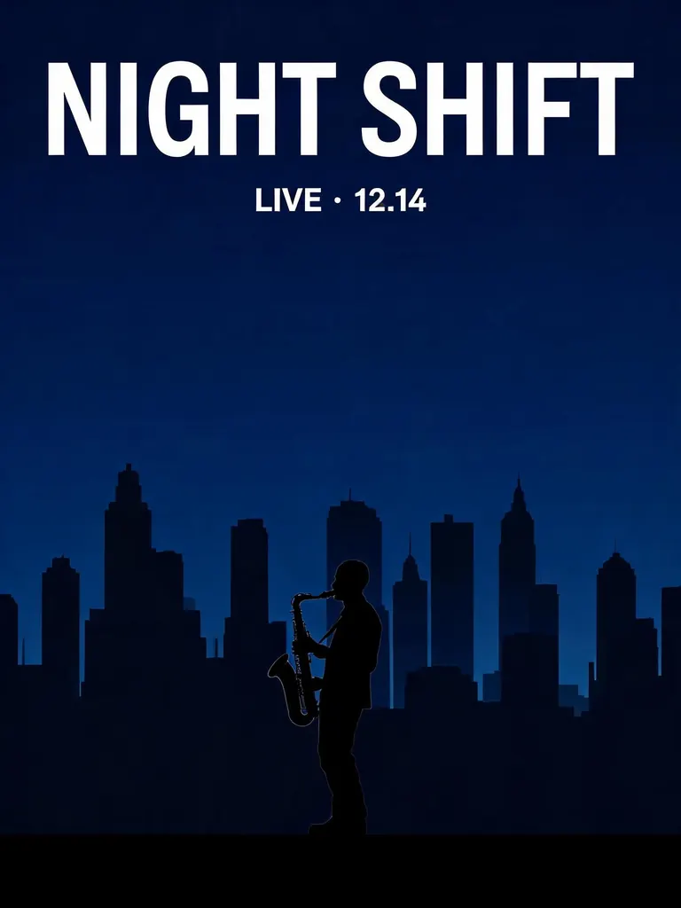
Two outputs from the same concert poster brief
Ofrai test · 2026-10-25 · 1K · 3:4 · one image per model from the same text prompt.
Minimalist concert poster with the headline "NIGHT SHIFT" in large bold white sans-serif letters at the top and "LIVE · 12.14" below it, a lone saxophonist silhouetted against a deep blue city skyline.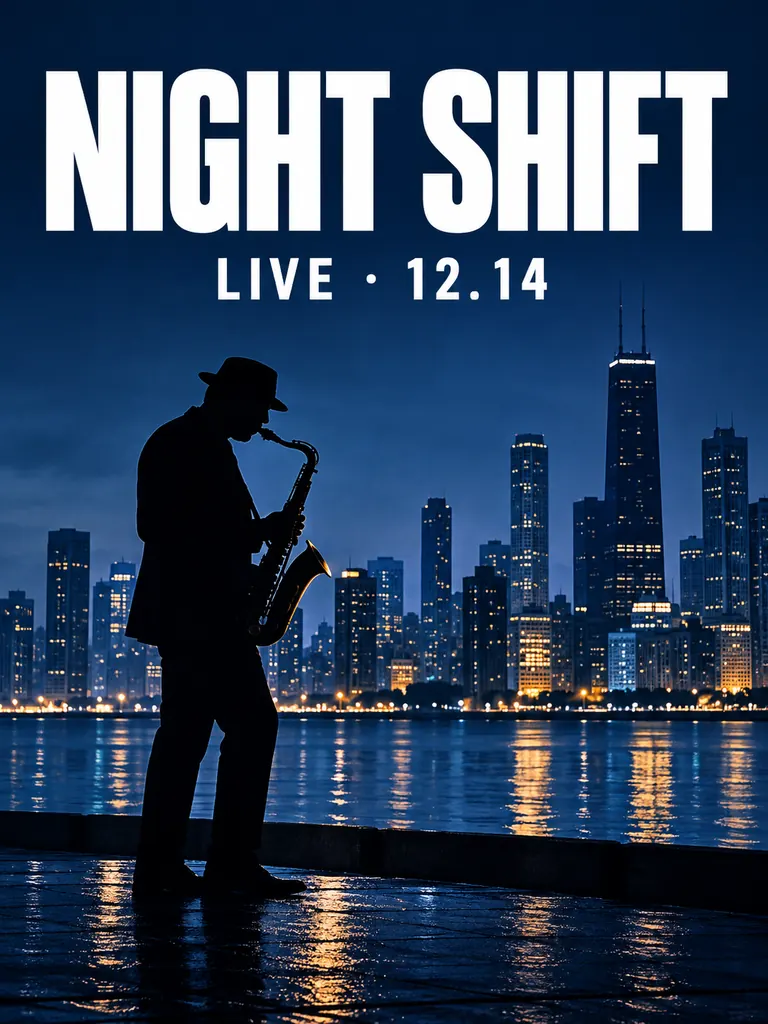
Poster layout examples
Example prompts
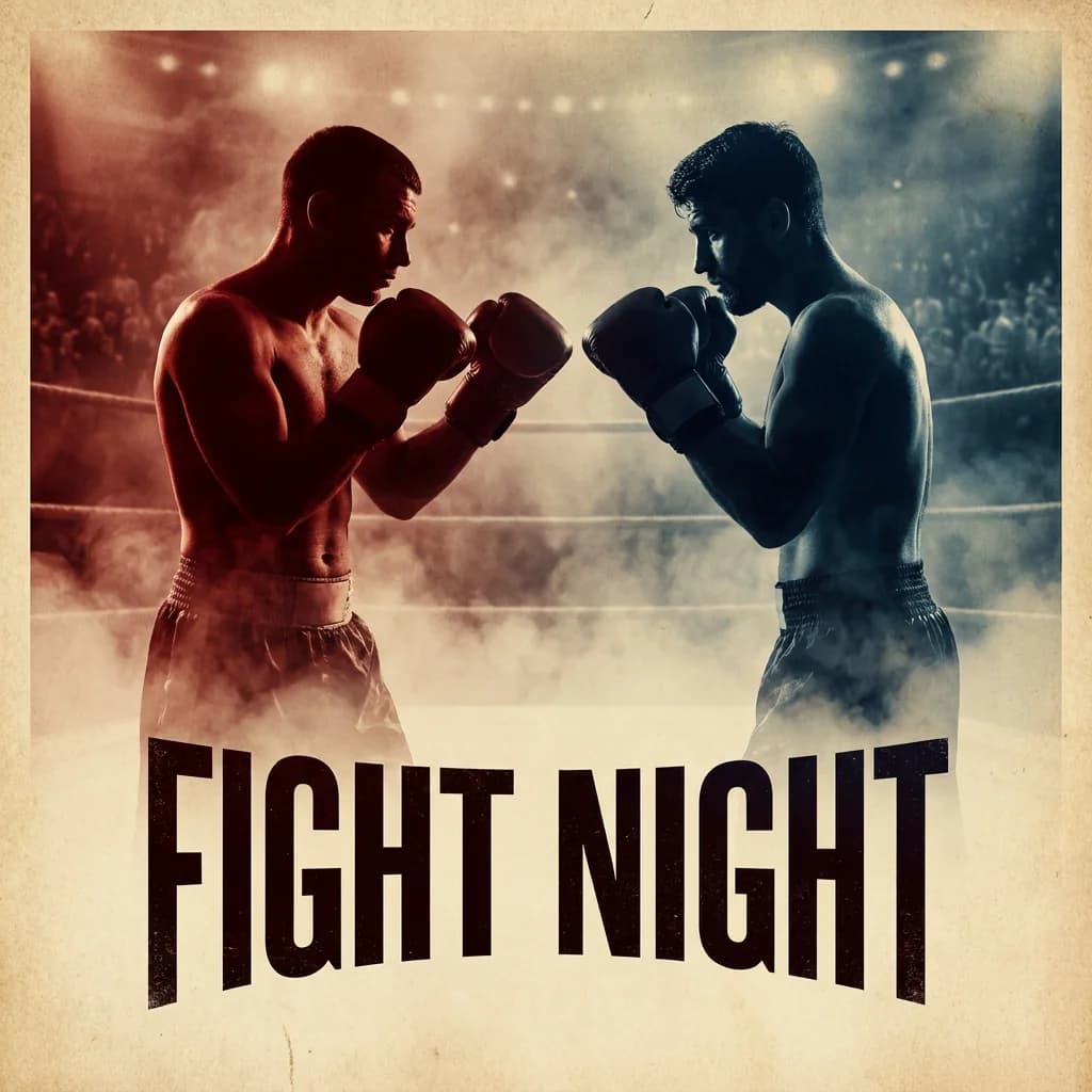
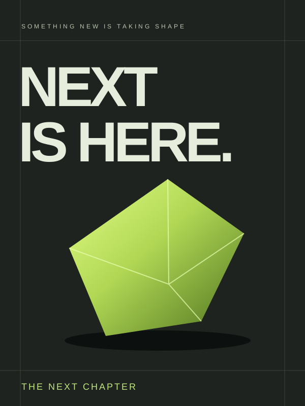
Contemporary music event poster with an adult dancer, bold geometric shapes, strong NIGHT SHIFT headline and clean editorial typography.
FAQ
- Can an AI poster generator render the text on a poster?
- Not reliably. Models can approximate short words but will not spell dates, URLs, or sponsor lists correctly. The reliable approach is to generate the poster with the type area left as an empty block and set the actual typography in Figma, Illustrator, or Canva afterwards. If you must have a real name in the image, keep it to one short word and check every character before publishing.
- How do I reserve space for a headline in a generated poster?
- Describe the open area as a named region rather than an intention: 'upper third left clear for a headline' or 'bottom strip reserved for date and venue', and leave at least ten percent margin so text never touches the trim. Avoid the phrase 'space for text', because models interpret it as an instruction to generate letters and will fill the area with pseudo-typography.
- Which Ofrai model is best for poster layouts?
- flux-2 for exploring layout ideas quickly, because poster work involves many rejected compositions. gpt-image-2 for the finished frame when structural clarity and clean edges matter most. nano-banana-pro when surface texture and material detail carry the design, such as a photographed object on a colour field. seedream-5 suits stylised and illustrated poster art.
- What aspect ratio should I use for a poster?
- Use the printer’s trim ratio for print, such as 1:√2 for A-series paper, 4:5 for social feed posts, 1:1 for square tiles, and 9:16 for stories and reels. Decide the ratio before you describe the composition, because the placement of the subject and the reserved text block depend on it. Regenerating at the wrong ratio late in a campaign wastes credits.
- How do I make the subject stand out from the background?
- Give the subject separation rather than relying on a complex background. Use 'subject sharply lit against a soft blurred background', a strong rim light separating figure from backdrop, or a large flat colour field with a long hard shadow. A subject floating in an empty void reads as a product mockup, not as a designed poster.
- Do I need design software to finish a poster made on Ofrai?
- Most designers use one, and it is a normal part of the workflow. Ofrai handles composition, palette, atmosphere, and the subject, which is the slow part. Setting final type, dates, and pricing in a conventional design tool takes minutes and guarantees the words are correct and legible at print resolution.
- Poster, fight poster, or thumbnail — which generator?
- Use this page for event, gig, and campaign layouts with a reserved title zone. Use the fight poster generator for boxing-style face-offs. Use the thumbnail generator when the job is click-through at tiny sizes with one huge face and almost no type room.
Related generators
- AI Sticker Generator
- AI Caricature Generator
- AI Fight Poster Generator
- AI Silhouette Generator
- AI Black And White Photo Generator
- AI Chibi Character Generator
- AI Classical Portrait Generator
- AI Cozy Anime Art Generator
- AI Cozy Winter Wallpaper Generator
- AI Crayon Drawing Generator
- AI Friendship Photo Generator for Two Friends
- AI Funny Photo Generator