Features
AI Crayon Drawing Generator
By Ofrai Editorial (Use Case Research)
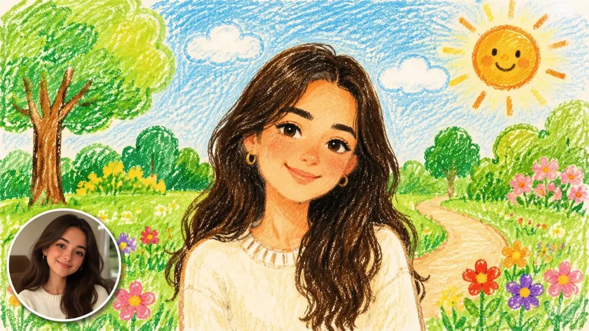
An AI crayon drawing generator turns a photo, a sketch, or a one-line idea into a childlike wax-and-crayon illustration in under a minute. Ofrai's Image Studio runs four live engines on a single credit balance, so you can test a cheap draft, move the same prompt to a stronger engine, and keep every version in your library. Upload a reference, describe the scene, set the ratio, generate, then upscale the winner for print. Crayon jobs hinge on three things: one clear subject, a named paper surface, and deliberate stroke direction.
New accounts include 1 free GPT Image 2.5 generation. Other models and video use credits.
Example prompts
Crayon kids-illustration look, grainy strokes
Wax and crayon marks that read as hand-drawn
Crayon renders collapse into fake filters when you describe the medium but not the pressure. Name the tool, the paper tooth, and the stroke direction: 'oil pastel and wax crayon on rough cold-press paper, visible diagonal hatching, heavy dark umber outline, translucent waxy layering where strokes overlap'. Engines that lean photographic will smooth wax into airbrush gradients; engines tuned for illustration keep the broken edge and the paper grain. Ask for uneven pressure and small gaps where the bare paper shows through.
Those gaps are what read as hand-made.
Prompt order that survives the texture pass
Put the medium last. A prompt that leads with 'crayon style' lets the texture swallow the subject; one that ends with it keeps the composition intact. A usable shape: subject, then action and setting, then composition and camera distance, then palette, then medium and surface. Example: 'a red fox asleep on a sunlit windowsill, curled tail over paws, medium shot, muted 1970s palette, oil pastel and wax crayon on cream paper'. Swap one variable per pass instead of rewriting the whole string.
Ratio and resolution for cards, stickers, and prints
Match the ratio to the artefact, not to the screen. 1:1 works for sticker sheets and social tiles. 4:5 or 2:3 can suit greeting cards. For A-series inserts, use the actual trim ratio. A4/A3 portrait framing keeps a full figure or a wide sky from being cut in half. Generate at the highest resolution the engine offers, then upscale before printing — crayon grain gains detail at large sizes but loses its softness when it is downscaled from a tiny canvas.
Leave a two-percent bleed if the piece will be trimmed.
Which of the four engines handles wax grain best
Treat them as a range, not a ranking. nano-banana-pro is the safest pick when you upload a reference photo and want it reinterpreted rather than replaced — it holds structure through heavy stylisation. gpt-image-2 is the one to use when the drawing contains readable text, a label, or a logo, because loose shapes and broken type are its known weak spot. flux-2 gives quick, cheap style passes for exploring a direction. seedream-5 tends to answer long illustrated prompts with dense, deliberate composition.
Keeping faces and hands from smearing
Crayon style is a licence to simplify, and simplification is where faces go wrong. Give two or three anchors — 'two round eyes, a small dot nose, no mouth detail' — instead of a full facial description. Hands usually need the same treatment: 'mitten-style hands, fingers suggested, no knuckle detail'. Long sleeves, mittens, pockets, or a hand holding a single large object all reduce failure rate. If a face keeps drifting, regenerate the head region with a tighter crop rather than rerolling the entire scene.
Building a matching set for kids media
Series work fails when each panel is generated from scratch. Write one style block — medium, paper, palette, outline weight, stroke angle — and paste it into every prompt unchanged. Vary only the subject clause. Character sheets work best generated as one image with several poses rather than as separate jobs.
Where crayon art works, and where it does not
This look earns its keep on greeting cards, storybook interiors, sticker sheets, nursery wall art, packaging illustration, and social posts that need to feel handmade. It is the wrong tool for logo line art, where the broken edge destroys the mark, and for anything that depends on crisp type or exact brand colours. Corporate headshots and product realism also suffer: the medium adds texture where you want skin and material truth. Choose a cleaner photographic engine for those jobs and use crayon only where the imperfection is the point.
Five crayon prompts with named paper and stroke
Fox on a sill: 'a red fox asleep on a sunlit windowsill, curled tail over its paws, medium shot, muted 1970s palette, oil pastel and wax crayon on cream cold-press paper, visible diagonal hatching, heavy dark umber outline'. Village street: 'a row of crooked houses on a hillside, laundry strung between windows, overcast light, wide establishing shot, limited palette of ochre, slate and brick red, wax crayon on textured grey paper, strokes following the rooflines'.
Birthday card: 'a round cake with seven candles, one child leaning in to blow, simple flat background, warm cream and red, crayon on heavy watercolour paper, thick confident strokes, no fine detail'. Character sheet: 'the same child in four poses and two expressions, evenly spaced on one sheet, plain white paper, consistent stroke angle, simple mitten hands'. Seasonal set: 'the same window in autumn, wet leaves on the sill, warm low light, same palette as the winter version, crayon on rough paper'.
Notice that paper and stroke direction are named in all five, and that no prompt asks for realism anywhere.
Aspect ratio and resolution for print
Match the ratio to the artefact rather than the screen: 1:1 for sticker sheets and tiles, 4:5 or 2:3 for greeting cards, the final trim ratio for A-series inserts, 3:2 for wall art, 9:16 for phone wallpapers. Generate at the highest resolution the engine offers, then upscale before printing, because crayon grain gains detail when enlarged and loses its softness when a small canvas is scaled up.
Leave about two percent of bleed on anything that will be trimmed, and keep the composition inside a safe area rather than letting an edge run off the frame.
Credit budget for a card set
A single crayon illustration is a light job: three to six generations, because the style block does most of the work. A card set is a production. Six cards with a shared palette and a recurring character typically runs twenty to thirty generations, and the extra cost comes from character consistency rather than from the crayon treatment itself.
The saving move is to design the character once, render it as a master, and use that image as the reference for every panel — then the set becomes a variation problem instead of a redraw problem. Draft every panel at low resolution on a cheap engine, because crayon style reads correctly even at thumbnail size, and rerun only the approved panels at delivery resolution.
If a face keeps drifting, regenerate just that head at a tighter crop instead of rerolling the whole scene, which is where most of the wasted budget usually goes.
Crayon drawing versus oil painting and sketch pages
Use crayon when the imperfection is the point: handmade texture, childlike warmth, a nursery or greeting-card register. Use an oil painting page when you want painterly richness with real canvas and varnish behaviour, which crayon cannot reach. Use a scribble or quick-sketch page when the request is loose and monochrome, since crayon introduces colour whether or not the brief asked for it, and a client who asked for a black ink drawing will not thank you for a coloured one.
Crayon also fails as logo work, because the broken waxy edge destroys a mark that has to scale down and embroider. If the deliverable depends on crisp brand colours or readable type, generate it clean instead. One practical crossover: a crayon illustration usually works well as a book or packaging interior, because the medium matches the object it is printed on.
Printing, trimming, and colour-proofing crayon work
Treat crayon art as a print production job, not a screen image. Wax crayon on paper does not reproduce the way a monitor shows it: whites go warm, mid-tones fill in, and the paper tooth adds texture the render only suggested. Proof on the actual paper stock before the full run, and expect to pull the saturation down slightly compared with the screen version. Ask for a flat matte finish rather than gloss, because gloss exaggerates the grain and turns it into sparkle.
Trim with a small bleed rather than to the exact artboard edge, since hand-drawn work benefits from an irregular edge and a machine-perfect cut makes it look printed. Keep the highest-resolution render and the original prompt for every panel — crayon jobs get revised constantly because clients fall in love with one panel and want the rest to match it, and regenerating from the master prompt is the only reliable way to get there.
Examples
FAQ
- Can I convert a real photo into a crayon drawing?
- Yes. Upload the photo as a reference in Ofrai Image Studio, select an engine, and describe the drawing you want in words — for example, 'reinterpret this photo as an oil pastel and wax crayon drawing on cream paper, keep the pose and framing'. Reference-driven engines such as nano-banana-pro preserve structure best; text-to-model engines will invent a new scene that merely resembles the photo.
- Which engine produces the most convincing wax crayon texture?
- There is no single winner. Use nano-banana-pro when a reference photo must survive heavy stylisation, gpt-image-2 when the drawing needs readable letters or a label, flux-2 for fast cheap direction-finding, and seedream-5 for dense illustrated compositions. The bigger lever is the prompt: naming the paper tooth, stroke angle, and pressure gaps matters more than engine choice.
- What aspect ratio should I use for a printable crayon picture?
- Use 2:3 or 4:5 for greeting cards, 1:1 for sticker sheets, and 1:1.414 or 1:1.3 for standard print paper. Generate at the maximum resolution available and upscale afterwards, because crayon grain reads better when it has pixels to occupy. If the piece will be trimmed, ask for a little empty margin so no stroke is cut at the edge.
- Can I sell crayon illustrations on products?
- Commercial rights depend on the model you select and the terms attached to it, so check the model page and your plan before publishing or listing merchandise. The illustrations you generate are yours to use as Ofrai permits; the model terms set the licence. Keep a record of which engine produced each final image, since that is the first thing a licensing question will ask.
- How many generations does a crayon drawing usually take?
- Expect three to six. The first two or three explore composition and palette, one or two fix a drifted face or hand, and the final pass is the upscale. Draft on a cheaper engine at a smaller resolution to keep credit spend down, then run only the approved prompt through a stronger model for the printable version.
- Where do my crayon drawings end up in Ofrai?
- Every generation lands in your Ofrai library with its prompt, engine, and settings attached. From there you can rerun the same prompt on a different model, generate a sibling image, or hand the frame to Video Studio as the first frame of an animation without exporting and re-uploading.
Related generators
- AI Caricature Generator
- AI Scribble Drawing Generator
- AI Black And White Photo Generator
- AI Chibi Character Generator
- AI Classical Portrait Generator
- AI Cozy Anime Art Generator
- AI Cozy Winter Wallpaper Generator
- AI Instant Film Photo Generator
- AI Liminal Space Image Generator
- AI Luxury Photo Generator
- AI Minimalist Photo Generator
- AI Oil Painting Generator