Features
AI Black And White Photo Generator
By Ofrai Editorial (Use Case Research)
An AI black and white photo generator converts an image into monochrome while preserving tonal range — deep blacks, luminous highlights, skin that still reads as skin. Generate in the aspect ratio you will print in, because monochrome hides exposure mistakes but not framing mistakes.
New accounts include 1 free GPT Image 2.5 generation. Other models and video use credits.
Example prompts
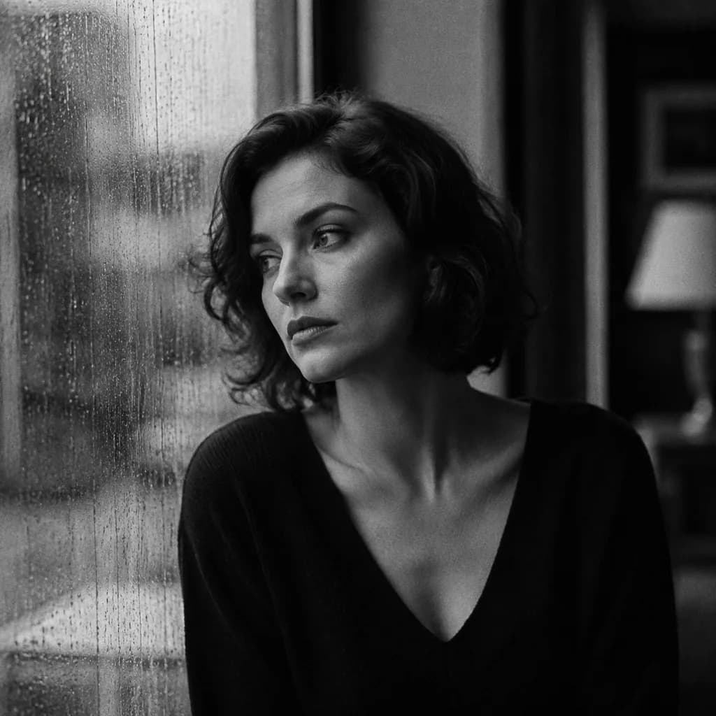
Fine-art monochrome portrait of an adult woman beside a rain-streaked window, deep blacks, controlled highlights, subtle 35mm grain, no color tint.
How an AI black and white photo converter keeps tone
The quality of a monochrome conversion is decided by how much light each colour held, and models cannot see that from colour alone. Name the tonal outcome you want instead: 'high-key, bright shadows, fine grain, airy skin' or 'low-key, deep blacks with no detail below 10 percent grey'. Then repeat the key surfaces — 'bright white shirt, mid-grey background, dark hair' — so the model builds a real luminance ladder rather than flat grey.
Monochrome styles that are actually different
Five treatments cover most intent, and they are not interchangeable. Silver gelatin: even tones, gentle grain, straight documentary. High-contrast: bright whites, blocked blacks, dramatic. Infrared: foliage glows white, skies go dark, skin reads waxy. Duotone: shadows tinted one colour, highlights another, printed as two inks. Orthochromatic film: reds render dark, blues render light. Name the style explicitly; 'black and white photo' alone will land you on silver gelatin almost every time.
Keeping skin believable after desaturation
Skin is the tell. Red disappears under desaturation, so red-lit skin collapses into grey mud. Fix it by describing the light rather than the colour: 'soft window light from camera left, no red or orange casts, skin one clean mid-tone with visible pores'. Add a tonal instruction such as 'skin slightly brighter than the background' and the portrait reads instantly. Avoid prompts that mention lipstick, blush or tan — the model compensates for colour and flattens the face.
Matching film stock and grain
Grain sells the monochrome look, but the wrong grain ruins it. Small, even, high-frequency grain reads as modern film; coarse, irregular grain with visible clumping reads as aged stock; no grain reads as a digital filter. Say which: 'fine uniform grain, ISO 400 look, no dust or scratches'. Add scratches and light leaks deliberately if you want the vintage read, because a single unrequested scratch makes the whole image look dirty.
Which engine handles an AI black and white photo best
gpt-image-2 is the strongest choice when the treatment is described in words, because it follows multi-constraint prompts more literally and holds skin tones without colour artefacts. nano-banana-pro wins when you convert a specific photo and want the composition preserved exactly — upload and describe the grade, do not re-describe the scene. flux-2 is the fast way to test three tonal ladders cheaply. seedream-5 covers illustrated monochrome, such as ink wash and sumi-e.
Printing ratios and dark borders
Monochrome photographs print beautifully in classic formats: 1:1 for square prints and social, 3:2 for standard camera prints, 2:3 for portrait and 5:4 for wall art. Generate at the final ratio rather than cropping later, because cropping a monochrome frame changes the balance of the composition in ways colour hides. If you want a border, ask for a real one — 'white print border, 8 percent of the short edge, even on all sides' — instead of adding it in an editor.
Fixing muddy midtones and plastic skin
Muddy midtones come from overlapping mid-grey across the whole frame. Fix them by naming one bright zone, one dark zone, and one mid zone, and by asking for separation: 'clear tonal separation between subject, background and clothing'. Plastic skin comes from beauty-style smoothing carried over from colour habits; counter it with 'visible skin texture, no retouching, no smoothing'. Another common issue is background clutter merging with the subject in grey — separate them with depth, not brightness.
Keeping the colour source for grading
Generate colour and monochrome from the same prompt and save both in your library. The colour version documents what the scene actually looked like, which matters if the job later needs a duotone or a warm-toned variant, and it gives you a fallback if the monochrome grade turns out too severe. When you batch a set, keep the model, ratio and grain description identical across every image, otherwise the series will not match on the wall.
Four AI black and white photo prompts by tonal key
High-key portrait: 'high-key black and white photograph, bright shadows with detail, airy luminous skin, subject wearing a white linen shirt, mid-grey seamless background, fine uniform grain, shot at 85mm, natural window light from camera left'. Low-key dramatic: 'low-key black and white, deep blacks with no detail below ten percent grey, single hard source from upper right, subject in profile, black jacket against a dark ground, visible skin texture'.
Documentary street: 'straight documentary black and white, available light, overcast day, grain ISO 400 look, pedestrians blurred in motion, wet pavement, even tones across the frame'. Figure study: 'black and white figure photograph, one bare shoulder and one lit shoulder, smooth tonal gradient from highlight to shadow, plain mid-grey ground, classical composition'. Each one names a tonal key before it names anything else, which is what makes these renders differ from a greyscale filter applied to a colour photo.
Grain and contrast for monochrome photos
Contrast is a prompt sentence, not a slider, so write the tonal endpoints instead of asking for more or less contrast. Grain follows the same rule and, more importantly, is a style decision: fine uniform grain reads modern, coarse clumped grain with visible edges reads aged, and no grain at all reads like a filter applied in software. Because monochrome hides hue, the model leans harder on the reference for structure, so keep it high, seventy percent or more, when you are converting a specific photograph.
Lower it, around forty, when you want a new composition and only need the general tonality as a guide.
Credits for a print series versus single conversions
A single conversion is cheap: upload, describe the grade, generate. Two to four generations usually produce a print-worthy result because the tonal ladder is a small set of constraints the models handle well. A print series is a different calculation. Twelve prints that share one grade should be generated as a set with an identical prompt skeleton, and the cost of the series is dominated by identity and framing problems rather than by the monochrome treatment itself, which is already solved.
Budget twenty to forty generations for a twelve-image series on a new subject, and use cheap drafts on flux-2 for framing tests before committing. High-resolution finals are the expensive part and should only run on approved frames. If the client wants both colour and monochrome versions, generate the colour version first and reuse it as the reference for the monochrome pass, which halves the framing work instead of solving it twice.
Monochrome conversion versus a filter or an editor
A monochrome filter in an editing app is free, instant, and reversible, and for an image you shot yourself it is usually better than a generated conversion, because it cannot invent detail that was not there. Reach for this page when the source is a scan, a low-resolution image, a film photo you want restored, a product shot that needs a specific gallery grade, or when the request is for a look that no real black and white film produced — infrared, orthochromatic, duotone.
Generated conversions also let you restage the light, which is the one thing a filter cannot do: you can move the key light, deepen the shadows, and render a tonal ladder the original photo never had. The trade-off is that the generator invents texture, so check skin carefully at print size before signing off. If the picture is going straight into a frame, a straight filter is the honest choice; if it is a concept piece, a graded generation gives you more control.
Preparing a monochrome set for print and gallery
Generate at the print ratio rather than cropping later, and give the frame breathing room: a white border on a print changes the perceived balance, and a monochrome crop removes margin that colour was hiding. Ask for the border in the prompt — 'white print border, eight percent of the short edge, even on all sides' — so the model renders it as part of the paper rather than as a frame.
Check three things at full resolution before approving: whether skin still reads as skin, whether the darkest area holds any detail, and whether the grain looks like the stock you asked for. Keep one grain sentence for the whole set, because mixed grain is the most obvious giveaway that a wall of monochrome prints came from different jobs.
If the set will be graded further in post, export the highest resolution the engine offers and specify that no grain should be added in the render at all, so the grain stays a decision you make once, at print size.
Examples
FAQ
- Will converting to black and white damage my photo?
- If you mean skin tone, it can, because red light vanishes under desaturation and red-lit skin turns to grey. Describe the lighting instead of the colour — for example soft window light with no warm casts — and ask for skin slightly brighter than the background.
- What is the best monochrome style for portraits?
- Silver gelatin, described as even tones with fine uniform grain, is the most forgiving for faces. High-contrast treatments are striking but block up in shadow detail, which is why they work better for architecture and street scenes than for close portraits.
- Can I get infrared-looking black and white results?
- Name it directly: foliage brightens, the sky goes dark, skin reads pale and waxy. It is a distinct look that the models will produce when you label it, and you can ask for it in the same prompt as a film grain description.
- How do I get a clean monochrome look without grain?
- Ask explicitly for a smooth, grain-free conversion with 'fine detail preserved, no film grain, no texture overlay'. Grain appears by default on many engines, so a negative instruction is usually needed to remove it rather than a positive one. The same caution applies to vignettes, glow and soft-focus filters.
- Which model gives the most consistent skin tones?
- gpt-image-2. It follows multi-constraint prompts most literally and holds skin mid-tones without colour artefacts. If you are converting a specific photo rather than writing the scene, use nano-banana-pro and describe only the grade. Convert from the reference photo rather than rewriting the scene.
- Can I use monochrome AI images commercially?
- Rights follow the selected model and model terms plus your plan. Check the model page before licensing, and record which engine produced each final asset, particularly for a series printed as one piece. Keep the grain description identical across a print series.
Related generators
- AI Instant Film Photo Generator
- AI Liminal Space Image Generator
- AI Luxury Photo Generator
- AI Minimalist Photo Generator
- AI Old Money Photo Generator
- AI Caricature Generator
- AI Chibi Character Generator
- AI Classical Portrait Generator
- AI Cozy Anime Art Generator
- AI Cozy Winter Wallpaper Generator
- AI Crayon Drawing Generator
- AI Oil Painting Generator