Features
AI Fight Poster Generator
By Ofrai Editorial (Use Case Research)
An AI fight poster generator builds two-fighter event artwork with readable silhouettes, dramatic lighting, and clear space for a title, date, and venue. Generate the artwork clean, then typeset the event information in a design tool — generated text is unreliable, and a poster lives or dies on readable typography. Plan the layout first, then prompt the fighters.
New accounts include 1 free GPT Image 2.5 generation. Other models and video use credits.
Example prompts
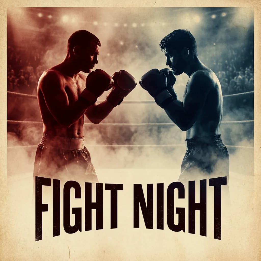
Timeless boxing event poster with two adult fighters facing each other, red versus blue arena lighting, smoky crowd, bold FIGHT NIGHT headline, no date or sponsor logos.
Composing an AI fight poster frame with two fighters
Two fighters in one frame is a hard balance problem. Fix the geometry before you describe anyone: place them at equal visual weight on a shared ground line, one advancing and one braced, with the horizon low so both bodies read full length. State the separation explicitly — 'the two fighters are clearly distinct silhouettes, no overlapping limbs, a strip of empty floor between them' — because merged figures are the most common failure in this genre.
Full-body framing also needs vertical headroom above raised arms and space below the feet for the title block.
Silhouette, impact, and negative space
A fight poster is read at thumbnail size first. Both figures must be identifiable as black shapes: different height, different stance, different hair or gear, and at least one prop or tattoo that reads as a block. Put the impact in the environment, not in a pile of limbs — a cracked floor tile, a torn ring rope, dust frozen mid-air, a shoe displaced from its mark. Empty floor in the lower third gives the type somewhere to live and stops the composition feeling crowded.
Leaving room for a title, date, and venue
Generate the plate without text, then typeset it. Ask for specific empty zones: 'clear empty floor across the lower third for a headline, clean wall area in the upper left for a secondary line'. Every major fighting promotion reserves the same zones, and building them into the render means you can swap the event details later for a rematch or a venue change without regenerating the art.
Style-driven engines will happily invent garbled lettering if you mention typography at all, so avoid words like poster, headline, and title in the prompt.
Color scripts: saturated, gritty, or posterized
Pick one colour script per poster and hold it. Saturated: two complementary colours, hot rim light, deep black shadows, skin tones pushed warm. Gritty: desaturated mid-tones, dust in the air, low contrast, a single saturated accent such as a red glove or a blood-coloured banner. Posterized: flat blocks of two or three colours with hard edges, which survives heavy downscaling and cheap printing better than gradients. Mixing scripts within one event looks accidental; consistency makes six different fight cards read as one brand.
Ring light versus arena light
Two lighting conventions give two different feelings. Arena light: high hard key from above and behind, strong rim on both shoulders, deep black background, sweat and dust catching the beam — cinematic and modern. Ring light: softer top light, visible ropes and canvas in frame, more even exposure across bodies, flash-burst highlights — classic and documentary. Whichever you choose, describe the source once and paste it into every prompt of the bracket, including the undercard and the results poster.
Fight-poster prompt skeletons
Build a reusable skeleton: [fighter A description] facing [fighter B description], [stance], [arena light setup], [colour script], [empty title zone], [grain and finish]. Two examples. Am Underground: 'a compact heavyweight in a faded gym vest, taped hands, braced forward, against a lean southpaw in a hooded robe with taped wrists, weight on the back foot, under a single hard overhead light, two-colour palette of rust and teal, clear floor in the lower third, heavy film grain'.
Bout Night: 'a lean southpaw in a hooded robe against a compact heavyweight in a faded gym vest, backlit by the arena rig, warm skin against black, empty ring canvas in the lower quarter, no text, no logos'.
A bracket of AI fight posters with one look
Event art lives or dies on consistency across a set. Approve the main-event frame, save it as a reference image, and generate every other card from it with only the fighters and colour accent changed. Order the work: main event first, then the title fight, then the undercard, then the results poster. Once a look is locked the remaining cards are cheap, and rerendering becomes a targeted edit rather than a redesign.
Two ready fight-poster prompts and the blank skeleton
Am Underground: 'a compact heavyweight in a faded gym vest with taped hands, braced forward, facing a lean southpaw in a hooded robe with taped wrists, weight on the back foot, a clear strip of empty floor between them, a single hard overhead light, two-colour palette of rust and teal, clear empty floor across the lower third, heavy film grain'.
Bout Night: 'the lean southpaw in a hooded robe against the compact heavyweight in a faded gym vest, backlit by the arena rig, warm skin against black, empty ring canvas in the lower quarter, no text, no logos'. Between the square brackets in the skeleton goes, in order: fighter A description, fighter B description, stance, light setup, colour script, empty title zone, and finish. Fill those seven slots and never change their order across a bracket.
Fighters change, the slot order does not, and that is what stops a six-card set from looking like six different events.
Aspect ratio and safe areas for a poster
Most promotions need two shapes: 2:3 or 3:4 for print posters and social, and 16:9 for a website header or a broadcast bug. Generate the plate at the ratio you will use most, and design the title zone into it rather than expecting to find space afterwards. State the safe areas explicitly as empty zones in the prompt — 'lower third clear of figures for a headline, upper left clean for a secondary line' — because a model asked for a poster will happily fill every inch.
Draft the remaining cards on a cheap engine at low resolution, since the composition is already proven by the main event.
Credits for a six-card bracket
One fight poster costs eight to fifteen generations, because two-figure balance is the hard part and balance improves by comparison. A six-card bracket — main event, title fight, two undercards, a results card and a fan poster — typically runs forty to sixty generations. The economy here is unusually good if you sequence properly: approve the main event first, then the remaining cards are variations of a proven composition, and most of them land in the first two or three takes.
Draft all six at low resolution on the cheap engine to confirm the compositions, then rerun only the approved cards at delivery size on the stronger engine. The one card that deserves extra attempts is the results poster, because it often combines two fighters from earlier cards and has to look like a culmination rather than another fight. Keep the approved main event in the library as the reference for the whole event, since it doubles as the key art for the announcement post.
Fight posters versus general poster and game cover pages
A fight poster has a job other posters do not: it must sell two specific people as opponents while leaving room for event data that is not in the render. A general poster page optimises for impact and mood, and it will happily centre a single figure and fill the frame, which leaves nowhere for a date. A game cover page optimises for a title-forward composition, usually with the game name dominant, which is the opposite of the empty-zone approach a promotion needs.
Use this page when the fighters are the content and the date is typography you add later. If the brief is a single-subject poster with no opponent, the general poster page is faster. If it is a game box, the game cover page handles the title lockup. The giveaway is whether two figures must read separately; if yes, this page.
Typesetting event details over the plate
Plan the type before the art, because the empty zones you reserve are what make typesetting fast. A workable promotion lockup needs a headline zone in the lower third, a secondary line for date and venue in the upper left or lower right, and a small logo zone kept clear of the figures. Keep type to two weights and one colour from the poster's own palette, and pull the accent colour from something already in the render rather than adding a new one.
Check contrast at thumbnail size, because a poster is read on a phone in a feed first. If the venue name is long, generate the plate with an even larger empty band rather than shrinking the type below readability. Export the plate at the largest render available, keep a clean version with no text, and store the type settings beside it, so the same art can be re-typeset for a rematch or a changed venue without regenerating anything.
FAQ
- How do I keep a whole fight card consistent?
- Approve the main-event frame, save it as a reference image, and generate the rest of the cards from it, changing only the fighters and the accent colour. Generate the main event first so the remaining cards follow an approved look instead of defining one.
- Why do the two fighters merge into one shape?
- Because the prompt never separated them. Write 'two clearly distinct silhouettes, no overlapping limbs, a strip of empty floor between them' and set them on a shared ground line at equal visual weight. Also check the framing: if the frame is too tight, the model crops the bodies and merges the remaining shapes to fill the space.
- Can the poster include the event name and date?
- Not reliably. Generated type is one of the weak points of illustration-oriented models, so it usually comes out as letter-like fragments. Generate the plate with empty zones for type, then set the real title, date, and venue in a design tool. Avoid words like poster, headline, or title in the prompt if you want to discourage invented lettering.
- Which Ofrai model suits fight poster art?
- Use nano-banana-pro when you are building a set from an approved reference frame. gpt-image-2 is the safer choice if any frame must contain readable text. flux-2 gives quick cheap drafts of poses and compositions. seedream-5 tends to fill long descriptive prompts with richer environments and lighting detail for arena scenes.
- What aspect ratio should a fight poster use?
- Use 2:3 for a printed one-sheet and 4:5 for social formats and card listings. Portrait framing leaves room for the lower-third title block, which is where most promotion art lives. Generate at the highest resolution available and upscale, and always leave headroom above raised arms so the figures are not cropped.
- Can I use generated fight poster art commercially?
- Usage rights follow the model you select and its model terms, so check the model page and your plan before printing posters or selling prints. Never depict a real fighter without their permission, and check local rules on likeness and event promotion. Keep prompts and engine names with each final file.
Related generators
- AI Poster Generator
- AI Sticker Generator
- AI Caricature Generator
- AI Friendship Photo Generator for Two Friends
- AI Funny Photo Generator
- AI Game Cover Art Generator
- AI Group Photo Generator
- AI Influencer Generator
- AI Silhouette Generator
- AI Thumbnail Generator
- AI Action Figure Generator
- AI Animal Generator for Pet Photos and Wildlife