Features
AI Thumbnail Generator
By Ofrai Editorial (Use Case Research)
An AI thumbnail generator produces cover images built for the size they will actually be judged at — a YouTube recommendation tile roughly 210 pixels wide, or a vertical cover competing in a short-form feed. You describe the subject, the expression and the lighting, generate at the delivery ratio, then add your own type in an editor. On Ofrai this runs in Image Studio, with the same credits you use for the rest of your pipeline.
New accounts include 1 free GPT Image 2.5 generation. Other models and video use credits.
Example prompts
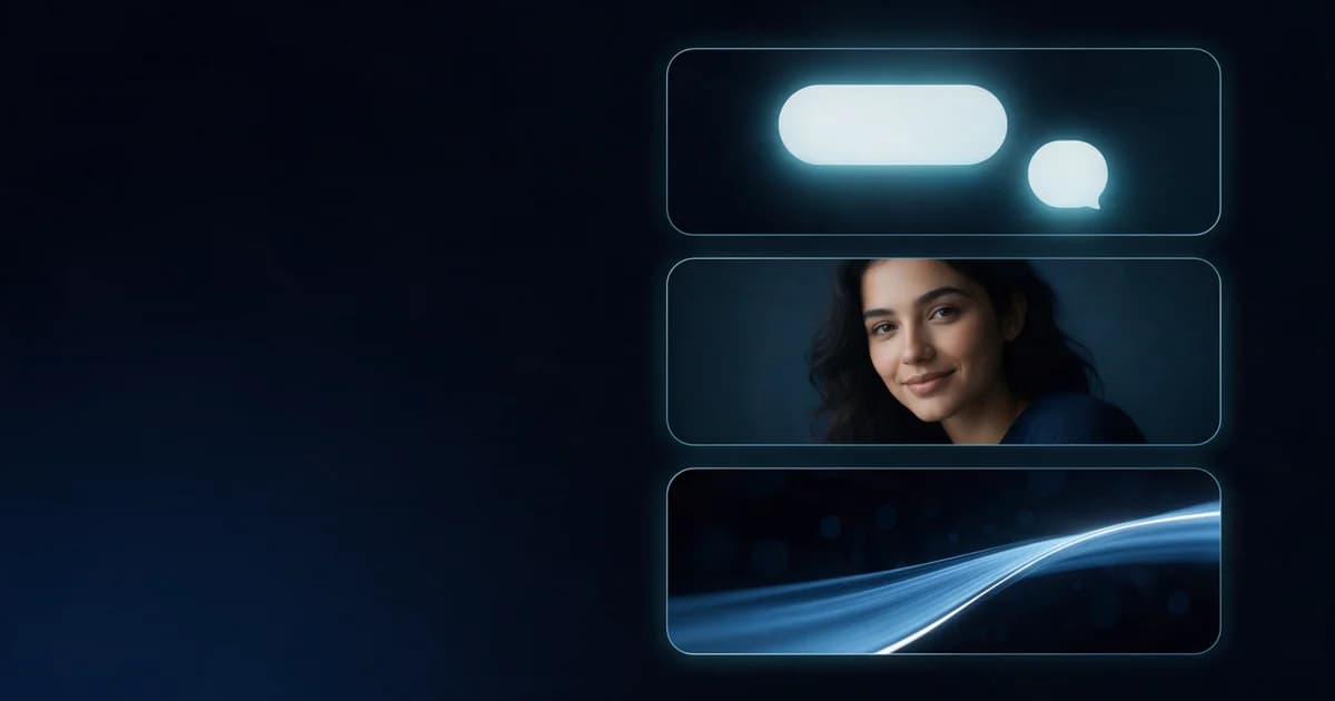
Dark brand UI: chat bubble, portrait card, and light-trail video card stacked, empty left margin
How thumbnails are judged at feed size
Nobody sees your cover full size. It appears beside a title, next to five other recommendations, at maybe 210 by 118 pixels, sometimes smaller. At that size three things decide everything: whether the subject separates from the background, whether the silhouette reads instantly, and whether the colour is warmer or more saturated than its neighbours. Design for that thumbnail, then check it by shrinking the render to feed size. If the subject only reads at full resolution, the cover is not working.
One focal subject beats a busy scene
The most common thumbnail error is trying to tell the whole story in one frame. A face plus one prop plus one strong colour is already a full brief at thumbnail scale. Wide ensemble scenes, multiple story beats and detailed backgrounds all collapse into noise once compressed. Generate the cover from the single most legible moment of your video, and let the title carry the setup. If you need to show a process, produce two covers instead of cramming both into one.
Reading the expression at two hundred pixels
Expression is the fastest signal available, and it only works if the engine renders it as an action rather than a mood. Ask for brows raised, mouth mid-word, head turned toward camera, eyes on lens — physical instructions survive compression; adjectives do not. Keep the head large in frame, ideally filling half the height, and shoot from a slightly low angle when you want authority. Avoid wide lenses that shrink the head, and avoid expression paired with a turned-away body, which cancels itself out.
Leaving room for the words you will add
Most creators add type in an editor, so plan the negative space before generating. Reserve roughly the upper third or the left third of the frame for a headline, and describe it: "clear empty background on the upper left for text." Then keep contrast in that region flat and mid-toned rather than busy. Ask the model to leave the space blank rather than to place a sign or a poster, since generated signage introduces visual noise exactly where the caption needs to go.
Lighting and colour that earn the click
Give the subject a clear key light with strong separation: rim light on the hair or shoulder, or a hard directional source producing a defined shadow. Avoid flat frontal light, which reads as a passport photo, and avoid dark, moody frames unless that is the channel's established look. Saturated but plausible colour usually outperforms muted colour in a crowded feed, because the eye is drawn to the most chromatic tile. Keep skin tones natural; oversaturated skin is the fastest way to make a cover look synthetic.
Thumbnail failures and the fix
Five failures cover most weak covers. The subject is too small: crop tighter and re-render rather than zooming a crop, since upscaling softens the face. The expression is neutral: rewrite it as a physical action. The background is busy: regenerate with a simplified or gradient backdrop. The caption space was forgotten: re-prompt with the empty region specified. The cover and the video disagree: generate from the actual first ten seconds of the edit rather than a concept image.
Which Ofrai engine suits cover work
nano-banana-pro is the strongest default: it follows long, specific instructions about expression and framing without ignoring earlier constraints. gpt-image-2 is the pick when the cover has to hold at high resolution or when props and hands appear in frame, since it renders them more reliably. flux-2 gives fast cheap drafts for testing three or four cover directions before committing. seedream-5 is helpful when you want a stylised or illustrated thumbnail rather than a photographic one.
Four thumbnail prompts written for feed size
"Close-up of a man mid-gasp, eyes wide, mouth open, lit hard from the left against a flat teal wall, extreme contrast, 16:9." "A woman in a yellow raincoat seen from behind in heavy rain, neon sign reflection on the wet ground, subject on the right third, 16:9." "Two halves of the same face split down the middle, one half smiling, one half furious, hard studio light, 4:5." "A hand holding a cracked phone toward camera, screen shattered, dark background, single rim light, 9:16."
Notice what each one commits to: a lighting setup, a subject position, and a quiet opposite side of the frame. That quiet region is what your title needs. Prompts written this way survive at 210 pixels because the subject separates from the background by luminance rather than by detail, and luminance is the only thing that fully survives the downscale.
Contrast, safe areas and the crop maths
Two numbers decide most thumbnail outcomes. The first is the luminance gap between subject and background: aim for a clear step, because a two-percent difference is invisible at feed size however good the composition is. The second is the safe area. For a 16:9 YouTube tile the title sits along the lower right, so keep the lower-right quadrant free of essential content; for a 9:16 short-form cover the interface overlays top and bottom, so keep the subject in the middle third vertically.
Test both cheaply by downscaling the render to about a quarter of its width and viewing it at arm's length. If you can name it in one glance, it works. If you have to lean in, it does not, and no prompt rewrite changes that — you need a different subject, not a better description.
Diagnosing a cover that fails when it gets small
Read the failure from the symptom. If the whole image reads as noise, the scene has too many elements and the prescription is subtraction, not sharpness. If the subject is legible but the emotion is not, the expression was described as a mood rather than a physical action, or the face is lit flat. If the subject separates but the frame feels dead, the background luminance sits too close, and the fix is a relight or a colour swap rather than a new generation.
If a caption you added afterwards disappears into the picture, the type is mid-value against a busy region and belongs on the quiet side instead. Run these checks in that order on a downscaled copy and change one thing per generation, because two simultaneous fixes produce a result you cannot attribute to either.
The cost of testing twenty covers a month
Twenty covers a month is a normal output rate for a single channel and the cost pattern is predictable. Draft on flux-2 at low resolution and run three concepts per video rather than one, because in a downscaled test a concept A with a different composition often beats a polished concept A and costs a fraction of it.
Once a concept survives the downscale check, produce it on nano-banana-pro, and reserve gpt-image-2 for the two or three covers each month that will run in high placements or in print. The place budgets leak is refining a cover that already lost at feed size: once the thumbnail test fails, the concept is dead regardless of how the full-resolution version looks, so stop rather than paying for a better version of a losing idea.
Where a thumbnail stops being a poster
A thumbnail is judged in under a second, at a size that punishes detail and rewards contrast. A poster is judged at a distance and rewards composition, type and negative space. That is why a beautiful editorial image often performs badly as a cover: it carries four focal elements, a considered palette and no clean region for a title, and all three are liabilities at 210 pixels. Use a poster tool for anything you will print, frame, or hand to a client as a piece of design.
Use a thumbnail generator for anything competing in a feed. If you are adding a headline before you know where the image will be displayed, you are making a poster. If the placement and the target ratio were decided in advance, you are making a thumbnail. When a video performs six weeks later, the reason is almost always reproducible, and reproducing it is the difference between a channel whose thumbnails improve and one that keeps guessing.
Pair that folder with a monthly look at the real click-through figures from your own analytics, because the cover that looked best in the folder is regularly not the one that performed.
And treat a losing cover as information rather than as a failure worth re-rolling: the most expensive habit on this page is regenerating a concept that has already been tested twice at feed size, because the full-resolution version of a rejected idea is still a rejected idea, only more expensive and more convincing to look at while you are deciding.
FAQ
- What size should I generate a YouTube thumbnail in?
- Generate at 16:9 at full resolution, then let the upload pipeline downscale. Rendering at the exact feed tile size looks soft; rendering oversized and letting the platform compress gives the cleanest result. For short-form feeds generate 9:16 instead, since a 16:9 cover cropped to vertical loses the face or the caption space.
- Should I let the model render the title text?
- Rarely. Generated text warps, especially on curved surfaces or at small sizes, and a misspelled word on a published cover is expensive to catch. Generate the cover with clean empty space where the headline goes, then set the type yourself in an editor where it stays crisp, aligned and legible.
- How do I make a thumbnail match my actual video?
- Export a frame from the real edit and upload it as a reference image, then describe the change you want — tighter crop, stronger expression, more dramatic light. Conditioning on a genuine frame keeps the wardrobe, location and props consistent with the footage, which a purely textual prompt cannot guarantee.
- Can I produce several thumbnail variants on Ofrai?
- Yes, and you should. Draft three or four directions cheaply on flux-2, keep the two strongest, then re-render those on nano-banana-pro or gpt-image-2 at full quality. Holding the prompt constant and changing only one element per variant — crop, expression, or colour grade — is what makes the results comparable.
- Do thumbnails need to match my channel's visual style?
- They need to be internally consistent, not identical to your other covers. Keep the colour grade, font treatment and framing habit stable so the channel reads as a set, while letting the subject and expression change per video. What you should avoid is inconsistency in the things viewers use to recognise your channel at a glance.
Related generators
- AI Logo Generator
- AI Animal Generator for Pet Photos and Wildlife
- AI Avatar Generator — Consistent Faces
- AI Caricature Generator
- Ecommerce Product Listing Images
- AI Fashion Model Generator
- AI Fight Poster Generator
- AI Friendship Photo Generator for Two Friends
- AI Funny Photo Generator
- AI Group Photo Generator
- AI Image Enhancer
- AI Influencer Generator