Features
AI Logo Generator
By Ofrai Editorial (Use Case Research)
An AI logo generator gives you strong concepts and a weak production file, so the workflow matters more than the tool. On Ofrai you use Image Studio with nano-banana-pro, gpt-image-2, flux-2, and seedream-5 to explore wordmarks, monograms, and icon marks, then convert the winner into real vector geometry. Generators are genuinely good at ideation and at pictographic marks; they are unreliable at letterforms, grid discipline, and small-size legibility. Plan for a tracing or redraw step rather than hoping the first render ships.
New accounts include 1 free GPT Image 2.5 generation. Other models and video use credits.
Example prompts
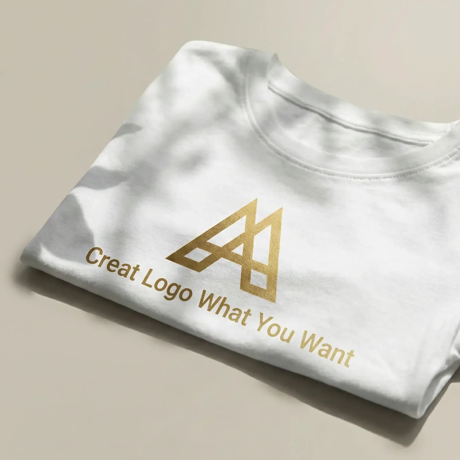
Folded white tee with gold foil mark, window shadows on fabric, brand sample shot
Choosing between a wordmark, monogram, and icon
Wordmarks depend on typography and fail hardest when a model improvises letterforms, so use them for ideation only and set the type yourself. Monograms — one or two initials inside a container — are a good middle ground because the letter count is small and errors are easy to spot and correct. Icon marks, especially pictographic ones tied to the industry, generate best: a compass for surveying, a bolt for electrical work, a mortar and pestle for a clinic.
If your brand needs to work at 16 pixels in a favicon, commission an icon mark and let the generator explore shapes for it.
Why generated lettering has to be redrawn
Diffusion models do not understand letterforms as vectors. They produce shapes that look like letters, and the errors are subtle until someone reads the word. Never ship generated text as a logo, and never let generated lettering sit inside a mark you intend to register. Generate the icon and the container, leave the type as an empty placeholder, then set the actual wordmark in a licensed typeface.
This is the single biggest quality gap between AI logo output and professional identity work, and skipping it is what makes cheap logos look cheap.
Building a mark that survives small sizes
Test at three sizes before you commit: 512 pixels for presentations, 64 for a social avatar, and 24 for a favicon. A mark with thin interior lines, gradients, or more than three distinct shapes disappears at 24. Prompt for simplicity explicitly — "flat single-colour mark, no gradients, no fine detail, readable at small size, generous negative space" — and reject any candidate that only works at large size. Solid silhouettes and strong figure-ground contrast survive reduction; thin strokes and multi-part compositions do not.
Prompting a logo with a real design brief
Write the brief the way a designer would brief a studio: industry, brand personality in three adjectives, the shapes you want to see, the shapes to avoid, and the usage context. "A mark for a neighbourhood bakery: warm, hand-made, geometric. A simplified wheat sheaf inside a rounded arch. Avoid laurels, wheat stalks with fine awns, and any script lettering." Explicit exclusions do more work than inclusions, because they steer away from the clichés the model defaults to.
Ask for flat vector-style rendering rather than 3D mockups, which produce unusable shading.
From raster concept to vector production file
Plan three steps: select or generate the best silhouette, trace it, then rebuild on a grid. Tracing gives you a starting outline. Redrawing on a geometric grid — a circle of a defined diameter, a square of a defined side, consistent stroke weight — is what makes a mark look designed rather than traced. Deliver as SVG with real paths, not an embedded raster, so it scales for print and signage.
This step is why vector logos remain hand-made even when the concept comes from a generator, and budget time for it.
Which Ofrai model suits logo ideation
nano-banana-pro follows a long, constraint-heavy design brief most faithfully, which makes it the best default for logo concept work. gpt-image-2 gives clean, graphic results and handles the "flat vector, no gradients" instruction reliably. flux-2 is fast and cheap for producing twenty directions in one batch before you refine any of them. seedream-5 tends toward finished-looking illustration and mockups, which is useful for presentation boards but not for isolated marks on a transparent field.
Failure modes and how to work around them
If you get a mockup instead of a mark, restate "isolated mark on a plain background, no 3D, no presentation mockup." If lettering is garbled, remove text from the prompt entirely and place it later. If every concept looks generic, you have described a category rather than a personality — specify the three adjectives and the exclusion list. If a mark cannot be traced cleanly because it is too intricate, simplify the geometry in the prompt and regenerate rather than attempting a difficult trace.
Four logo briefs you can paste as written
Bakery: "a logo for a neighbourhood bakery: warm, handmade, geometric. A simplified wheat sheaf inside a rounded arch. Flat single colour, no gradient, no fine detail, readable at small sizes, generous clear space, plain white background, no mockup." Clinic: "a logo for a dermatology clinic: calm, clinical, geometric. A mortar and pestle simplified into two overlapping circles. Flat single colour, no gradient, no fine detail, readable at small sizes, plain white background." Coffee roaster: "a logo for a small coffee roastery: bold, hand-drawn feel, warm.
A simplified coffee bean inside a hexagonal badge. Flat single colour, no text, no mockup, plain white background." Each brief supplies an industry, three personality adjectives, one shape to include, and an exclusion note. The flat-colour and no-mockup clauses do as much work as the shape description does.
Export and background settings that keep a mark reusable
Saving the concept in a reusable form is a settings decision, not a finishing decision. Background: request a plain white or transparency-friendly field, because a rendered scene around the mark means you will be extracting it by hand before any vector work can start. Canvas: 1:1 leaves room for clear space around the mark, while wide ratios make a small mark look lost inside the frame.
Resolution: render at 1024 pixels or more so there is enough data to trace from, even though the final file will be a vector. Variants: ask for the reversed white-on-black version in the same run, because checking the reverse early is how you discover that a mark only works in one polarity.
How many concepts to run and how many to shortlist
Volume is cheap and judgement is not. Run twenty to thirty concepts across two or three genuinely different directions rather than forty variations of one idea, and change direction in the prompt itself — "geometric and angular" against "organic and hand-drawn" — rather than re-rolling identical words. Shortlist to five, then to two. At five you can hold them all against the exclusion list from the brief; at two a client can actually choose. Only then pay for the slow pass: the higher-resolution render, or the traced rebuild.
The most common waste in logo work is generating forty marks and evaluating them one at a time at full size, which is exactly backwards.
What a logo exploration round costs in credits
Logo exploration is unusually cheap per render because the images are small and the prompts are short. Exploration: twenty flux-2 concepts across two directions, the bulk of the budget and the cheapest stage available. Refinement: five nano-banana-pro renders on the shortlisted prompts, where long constraint-heavy briefs start to pay off. Presentation: two large gpt-image-2 frames on a clean background for a proposal board.
That is around twenty-seven renders for a full round including a presentable shortlist, and none of it requires a second plan or a second subscription. On Ofrai every render draws from the same credit balance. On a tight budget, cut exploration to twelve and keep the refinement pass intact — twelve concepts across two clear directions usually surfaces two winners.
Presenting concepts while they are still raster
Raster concepts are perfectly adequate for the first conversation and actively harmful after it. In the proposal stage, a clean mark on a plain background communicates shape and proportion, which is what a client reacts to. The risk arrives when someone asks which one they prefer, because they may be approving a letterform or a proportion that cannot be redrawn.
Guard against it by presenting two columns: the generated concept, and a rough traced version of the same mark, so the client is visibly choosing the idea rather than the raster execution. Agree the brand word and its correct spelling before any lettering is generated at all — a misspelt wordmark approved at this stage is the most expensive error in the process.
Where this workflow ends and a designer takes over
This workflow is genuinely strong at ideation, pictographic marks, internal project identifiers, event marks, and the first direction of a brand identity. It stops being adequate at three points. Registering a trademark requires a mark distinct from existing marks in your class, which is a legal search handled by a designer and an attorney together. Anything a third party will later edit — recoloured by a partner, resized by a non-designer, animated for a launch film — needs real vector geometry from the start.
And a full identity system with a type pairing, grid rules, and usage guidelines is design work rather than generation. Budget the designer in at the beginning rather than after the concept has been chosen.
For a shield, motto, and symbolic charges, use heraldic crest concepts.
Examples
FAQ
- Can I use an AI-generated logo commercially?
- Commercial rights depend on the model you select and your Ofrai plan terms, so check the model page first. Separately, a logo should be distinctive enough to register, and you cannot verify uniqueness from a generator alone — run a trademark search in your target class before committing to a mark.
- Why does the text in AI-generated logos look wrong?
- Diffusion models do not construct letterforms the way type does. They produce shapes that resemble letters, and the errors only become obvious when someone reads the word. Generate the icon and leave the type as an empty placeholder, then set the real wordmark in a licensed typeface.
- What kind of logo does AI generate best?
- Pictographic icon marks tied to a clear industry category generate most reliably, because the model has strong visual associations to draw on. Monograms with one or two initials are workable. Wordmarks are the weakest, since they depend entirely on typography that you will need to set yourself.
- How do I make a logo work at small sizes?
- Test candidates at 512, 64, and 24 pixels before committing. Reject anything with thin interior lines, gradients, or more than three shapes. Prompt for flat single-colour rendering, generous negative space, and strong figure-ground contrast — those are what survive favicon scale.
- Do I need to convert the generated logo to a vector file?
- Yes. Trace the best silhouette, then rebuild it on a geometric grid with a consistent stroke weight and deliver as SVG with real paths rather than an embedded raster. This redraw step is what separates a designed mark from a traced one, and it is still hand work.
- Which Ofrai model is best for logo concepts?
- nano-banana-pro follows long constraint-heavy design briefs most faithfully. gpt-image-2 gives clean flat graphic results, flux-2 is the cheapest way to generate twenty directions in one batch, and seedream-5 leans toward illustration and mockups rather than isolated marks.
Related generators
- AI Thumbnail Generator
- AI Animal Generator for Pet Photos and Wildlife
- AI Avatar Generator — Consistent Faces
- Ecommerce Product Listing Images
- AI Fashion Model Generator
- AI Image Enhancer
- AI Luxury Photo Generator
- AI Packshot Generator
- AI Portrait Generator
- AI Product Cutout Generator
- AI Product Photo Generator
- AI Transparent Product Assets