Features
Qwen Image 3 Guide for Layouts and Text
By Ofrai Editorial (Use Case Research)
The Qwen Image 3 branch is known for two things practitioners notice immediately: it follows layout instructions closely, and it handles Chinese-language text in images without turning it into invented glyphs. On Ofrai it runs in Image Studio next to gpt-image-2 and flux-2 on one credit balance, which makes routing simple — send structured layouts and bilingual signage here, send English-heavy editorial typography to GPT Image 2, and use flux-2 for cheap photographic exploration. This guide covers the prompt patterns that work, and where the branch still needs help.
New accounts include 1 free GPT Image 2.5 generation. Other models and video use credits.
Example prompts
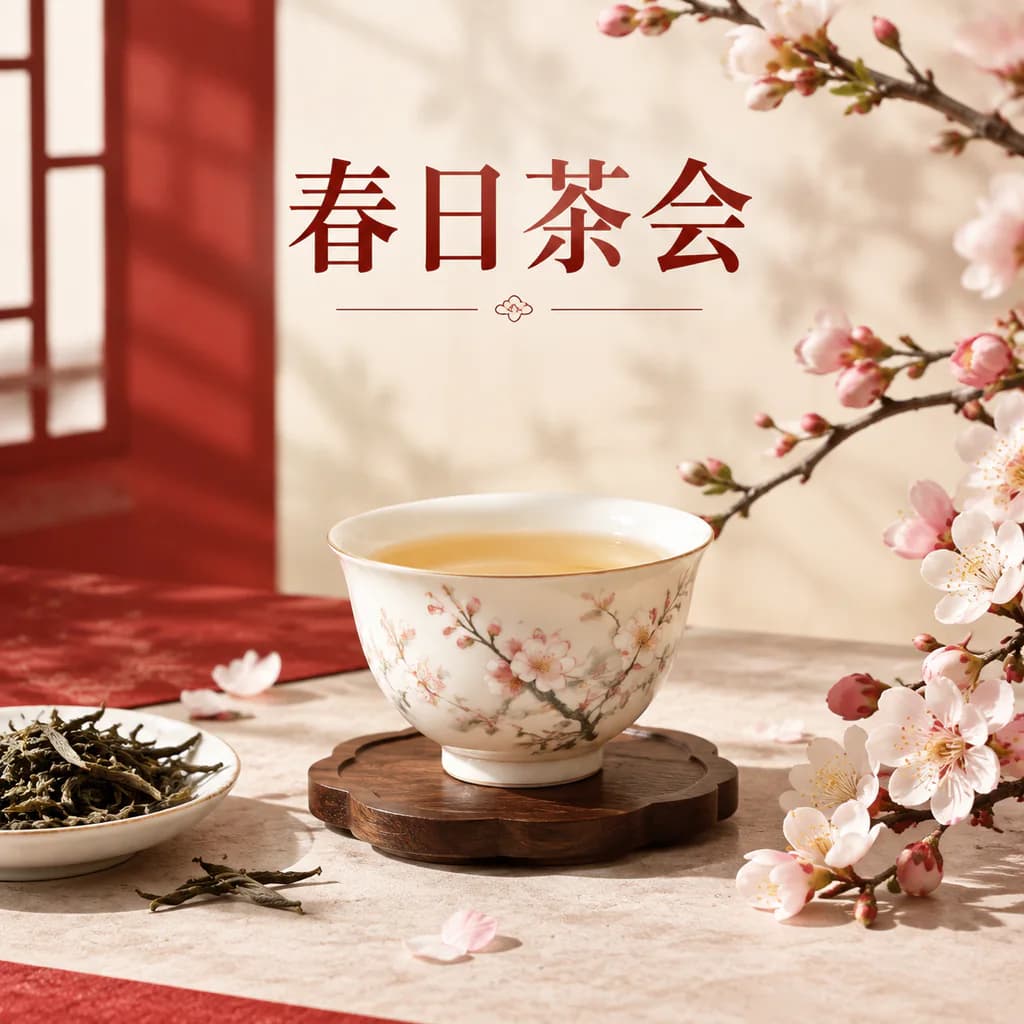
Elegant Chinese tea campaign poster with a porcelain teacup, spring blossoms and the accurate Chinese headline 春日茶会, refined red-and-cream editorial layout.
What Qwen Image 3 does better than the alternatives
Two classes of work justify routing here. First, bilingual and Chinese text: posters, packaging, signage, packaging copy, and any frame where the words must be Chinese, or Chinese alongside English. This branch holds Chinese characters legible far more often than engines trained mainly on Latin typography, which matters enormously for product and marketing work in Chinese-speaking markets. Second, layout discipline: when you specify region, order, and alignment, it tends to place elements where you said.
That combination — correct characters plus correct placement — is rare enough to be the deciding factor on real briefs rather than a curiosity.
Structure-first prompt construction
This branch responds best when you describe the frame as a layout before you describe style. Write the structure as an ordered list: headline area, subhead area, image area, then contact strip. Add the typography role for each region ('headline: large bold Chinese characters, centred'), the hierarchy you want ('headline reads first, product name second'), and the aspect ratio. Then add style as a final layer — palette, material, lighting.
This ordering keeps the text regions stable across reruns, which is what makes a set of variants feel like one campaign instead of four unrelated posters.
Writing Chinese text that renders correctly
Chinese text needs different handling from Latin text because character count carries meaning rather than word boundaries. Keep copy short — a four to eight character headline is reliable, a full sentence is a gamble. Quote it exactly with 「」 or quotes so the model treats it as literal content. Specify the type explicitly: '黑体', '宋体', or a described weight like '细长无衬线'.
When Chinese and English appear together, state them as separate regions with separate styles rather than one mixed line, and place English as a smaller supporting line. If a run produces mangled characters, shorten the string rather than re-rolling the same prompt; that fixes it far more often than any style change.
Reference-guided iteration on this branch
The productive loop here is reference-led rather than blind. Keep one approved frame as the layout master, then for each variant upload it and describe only what changes: new colourway, new headline, different product angle. Restate what must hold — grid, image placement, logo position — because layout elements drift when the styling changes even slightly. One variable per pass, exactly as you would in an editing session.
This is also how you build a campaign: one master layout, then five or six colour and copy variants that stay recognisably the same poster.
Known failure modes and their fixes
Four recurring issues. Character drift: a headline comes back with one or two wrong strokes — shorten the string to six or fewer characters, or set the text as a graphic element rather than a rendered string. Element collision: text overlaps the image area — restate the regions as a numbered list with explicit empty space. Wrong script substitution: asked for Chinese, received Latin — repeat the language in the same clause as the copy ('以下为中文文字:……').
Inconsistent sizing across a set — reuse the previous frame as reference and state the size relationship instead of an absolute size. In every case, the fix is more structure, not more adjectives.
Routing decisions against gpt-image-2 and flux-2
Choose by deliverable. Send English-heavy typographic work, Western editorial layouts, and any job where precise Latin kerning matters to gpt-image-2, which is the strongest of the three on Latin text. Send composition exploration, large batches, and naturalistic photographic work with no text to flux-2, because it is fast and inexpensive and structurally steady. Send Chinese or bilingual typography, dense structured layouts with multiple text zones, and reference-led variant sets to this branch.
Running all three on the same brief for a campaign poster is a legitimate and often decisive comparison, and on one Ofrai balance it costs less than the decision of guessing wrong.
A campaign workflow that uses the branch properly
Sequence it so structure is fixed before styling moves. Step one, on flux-2, block the grid at the final ratio with placeholder zones and no text. Step two, promote the approved grid to this branch and generate the real Chinese headline and supporting copy, fixing the type roles. Step three, hold that frame as master and run five to six colour and copy variants by reference, changing one element each time.
Step four, verify the hero variant for character accuracy at higher resolution, then typeset any remaining dense text yourself. The expensive renders happen once, on a layout that is already known to work.
A full bilingual brief written for this branch
Structure first, style second, text last. A working bilingual poster brief looks like this: “Layout: headline zone occupies the top 28 percent of a 3:4 poster, generous margins, left aligned. Image zone below: a quiet bamboo grove at first light, mist between the trunks, one figure in pale linen seen from behind at lower right. Palette: rice-paper cream, ink grey, one muted jade accent. Text — headline, exactly: ‘四时有序’ in a bold Song-style serif, characters large and evenly spaced.
Sub-headline, exactly: ‘生活有节’ in a light sans, one size down, left aligned beneath the headline. Body copy: three short lines, each no longer than eight characters. Constraints: no Latin characters anywhere except a small credits line; no drop shadows on type; every Chinese character correct and legible.” The layout is fixed before any style word appears, which is what makes later variants cheap.
Parameter behaviour and CJK-specific settings on Qwen Image 3
Aspect ratio drives text layout more here than in most work, because Chinese headlines are usually placed by zone — top band, lower third, centred column — and those zones only exist at particular ratios. Generate at the delivery ratio, never at a square to be cropped later, because a CJK headline cropped at the wrong point loses a whole word.
Set resolution from the smallest type in the layout: if body copy is eight characters per line and must stay legible on a phone, a 3:4 poster needs enough pixels for those characters to be readable at all, which usually means the upper end of the range.
When to iterate by reference and when to rewrite
Use reference iteration when the structure is right and the styling is wrong: upload the approved layout and describe only what changes, as in “keep this exact layout and grid, change the palette to cooler tones, increase the mist density.” Rewrite from scratch when the structure is wrong — if the headline zone sits in the wrong place, iterating on it tends to preserve the error, because the model treats the reference as authoritative.
The test is simple: if you can describe the change as “everything the same except X”, use a reference; if the change is structural, rewrite. And when type comes back with a wrong stroke, do not iterate on that frame at all — shorten the string, since a five-character headline fails far less often than a twelve-character one, then re-run from the layout master.
Credit behaviour for bilingual typography work
Typographic work is expensive in a specific way: its failures are small, so they are invisible at draft resolution, which means you cannot fully validate a frame before committing to a high-resolution render. Restructure the work so the expensive pass carries less risk. Draft the layout as placeholder zones with no text at all on flux-2, where text cannot fail because there is none — this settles composition, zone sizes and margins cheaply.
Then render text only once the grid is approved, on this branch, at full resolution, one or two candidates. Expect roughly four to six generations per final poster: two layout drafts, one to three text renders, one repair. Every generation shows its Ofrai credit cost before it runs, and the step most often dropped is exactly the one worth keeping: the text-free draft.
Who this branch is for, and who should route elsewhere
This branch earns its place when Chinese characters are content rather than decoration in the deliverable: bilingual posters, packaging copy, signage, book and editorial layouts, product packaging for a Chinese-speaking market, and any work where the headline is the design. It is also the right branch when you cannot afford to get type wrong, because a single incorrect character in a headline is a revision request at best and a credibility problem at worst.
Route elsewhere when the deliverable is English-heavy Western editorial typography, where gpt-image-2 holds Latin kerning and Western layout conventions more reliably; when the deliverable is purely atmospheric with no text at all, where flux-2 is cheaper and faster; and when you need photorealistic identity matching across many frames, where reference-led editing on another branch is stronger.
FAQ
- What is Qwen Image 3 best at on Ofrai?
- Chinese and bilingual text inside images, plus layouts with several defined text zones. It renders Chinese characters legibly far more often than engines trained mainly on Latin typography, and it tends to place elements where your prompt says to put them, which makes it a strong choice for posters, packaging, and signage in Chinese-speaking markets.
- How do I get correct Chinese characters in the image?
- Keep the copy short, ideally four to eight characters, quote it exactly, and name the typeface such as 黑体 or 宋体. State the region and hierarchy too, for example 'large bold headline centred in the upper third'. If a run mangles characters, shorten the string rather than rerunning the same prompt, since length is the usual cause.
- Should I use GPT Image 2 instead for typography?
- Yes, when the copy is English-heavy or Western editorial layout and precise Latin letterforms matter. gpt-image-2 handles Latin text and kerning more reliably than this branch. Route to Qwen Image 3 specifically when Chinese or bilingual copy is central, or when you need multiple defined text zones positioned by instruction.
- How do I keep a set of poster variants consistent?
- Fix one approved frame as the layout master, then generate each variant by uploading that frame and describing only the change, restating what must hold: grid, image placement, logo position. Change one element per pass. That reference-led loop is what keeps a variant set looking like one campaign.
- Why does text overlap the image or change size between runs?
- Both are structure problems rather than style problems. Describe the frame as an ordered list of regions with explicit empty space, then state the hierarchy between headline and supporting copy. Across a set, reuse the previous frame as a reference and describe size relationships instead of absolute sizes.
- How do I plan a bilingual campaign without wasting credits?
- Block the grid cheaply on flux-2 with placeholder zones, render the real copy once on this branch to fix the type roles, then run five or six variants by reference changing one element each time, and verify the hero frame at higher resolution before producing it at final quality. Dense remaining text is usually faster and cleaner to typeset yourself.
Related generators
- AI Action Figure Generator
- AI Animal Generator for Pet Photos and Wildlife
- AI Avatar Generator — Consistent Faces
- AI Black And White Photo Generator
- AI Caricature Generator
- AI Character Sheet Generator
- AI Chibi Character Generator
- AI Classical Portrait Generator
- AI Cozy Anime Art Generator
- AI Cozy Winter Wallpaper Generator
- AI Crayon Drawing Generator
- AI Creature Wallpaper Generator