Features
Cyberpunk AI Art Generator
By Ofrai Editorial (Use Case Research)
A cyberpunk AI art generator earns its name on three things: a constrained neon palette, one dominant light source per shot, and atmosphere that occupies real depth. Ofrai's Image Studio gives you four engines for exactly that — flux-2 to block composition cheaply, nano-banana-pro for hardware and reflective surfaces, gpt-image-2 when your sign typography has to be readable, seedream-5 for stylised poster treatments. Write the prompt as an environment first and a person second, and the results stop looking like generic neon soup.
New accounts include 1 free GPT Image 2.5 generation. Other models and video use credits.
Example prompts
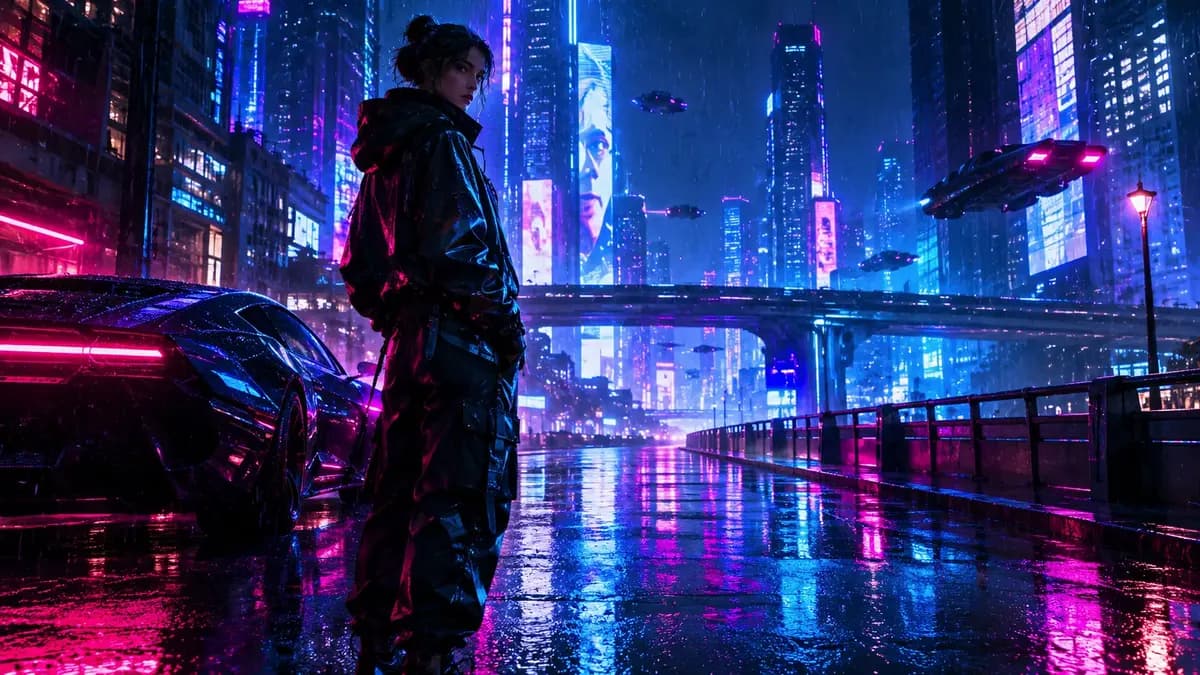
Cyberpunk night street, neon and rain haze
Cyberpunk is a lighting system, not a colour palette
The single biggest reason cyberpunk images look cheap is that the style gets described as a colour list. Magenta, teal, blue, orange — four saturated hues at equal strength read as a filter, not a world. Real cyberpunk lighting is asymmetric: one dominant source, usually a sign or a streetlight, throwing coloured spill onto wet surfaces, with everything else falling into darkness.
Describe the key explicitly — 'a single magenta shop sign above the doorway is the only light source, cyan reflections picking up off the wet ground' — and the image gains depth, because you have told the model where light comes from and where it stops. Name a secondary fill at no more than a third of the key's intensity.
Building the atmosphere: rain, haze, and steam
Atmosphere is what separates a rendered city from a photographed one, and it is cheapest to write as three separate cues. Volumetric haze makes beams visible: 'thick low fog, light shafts cutting between buildings'. Wet ground doubles every light source for free: 'rain-soaked asphalt, mirror reflections of the signage'. Particulate matter adds a layer between camera and subject: 'fine rain streaks, backlit, falling through the sign light'. Write at least two of the three per generation.
With only one, the scene flattens into a clean illustration, which is why single-line cyberpunk prompts so often return poster-flat images with no depth cue at all.
Materials that sell the genre
Four materials carry most cyberpunk imagery: chrome, wet asphalt, dirty glass, and corroded metal. Name the finish, not the substance. 'Polished chrome with fingerprint smudges' reads very differently from 'chrome'. 'Corroded copper with verdigris streaks' is a strong, specific cue that most prompts miss. Dirty glass is the cheapest atmosphere in the whole genre — 'a rain-streaked window in the foreground, city lights diffusing through it'. When a render looks generic, the problem is usually that every surface was left unspecified, so the model defaulted to smooth plastic.
Two or three material sentences will fix it faster than a longer style paragraph.
Readable neon signage with gpt-image-2
Cyberpunk art usually lives or dies on its signs, and illegible fake lettering is the most recognisable tell. gpt-image-2 is the engine on this page that handles text inside the image, so route your signage shots to it. Quote the exact string you want — 'a vertical shop sign reading KIROSHI RAMEN' — and put it early in the prompt, then state that the letters must be legible and correctly spelled. Keep sign copy to one to three words.
Longer invented signage drifts into pseudo-characters even on capable models, and if you need a wall of ads, generate the wall clean and add real type in an editor afterwards.
Framing: low angles, tight lenses, and deliberate emptiness
Genre convention and good composition happen to agree here. A low camera looking up at a figure against a sign puts the light behind the subject and gives you a rim highlight for free. Tight focal lengths (85mm and above, named in the prompt) compress the signage into a dense bokeh field, which sells the sense of a crowded city without modelling a crowd.
For the wide establishing shot, name the emptiness explicitly — 'the street is empty, no other figures' — because otherwise the model fills it with generic pedestrians and your hero subject stops being the subject. Reserve one figure per frame, and give the camera a reason to be where it is.
Which model handles which part of the set
Split the set by job. Block the composition on flux-2: cheap, fast, and structurally sound, so it is the right place to test where the sign sits and how much street you want. Promote locked frames to nano-banana-pro for hardware, chrome, and reflective surfaces, and for any frame where a character's face or outfit must match another frame in the set. Route sign-bearing frames to gpt-image-2.
Use seedream-5 for flat graphic treatments — album covers, poster variants, thumbnails — where a designed palette and bold composition beat photographic truth. A ten-image set built this way typically costs a small fraction of running everything on the premium engine.
Where cyberpunk renders break, and the fix
Five failures cover most rework. Palette mush: too many competing light colours — cut to one key plus one accent. Uniform brightness: nothing falls into shadow — add 'deep shadow areas with no fill light'. Fake signage: illegible invented lettering — use gpt-image-2, shorten the copy to three words or fewer, or add type later. Generic crowd: strangers appear next to your subject — add 'only one person in the frame'. Plastic surfaces: everything looks rendered — add dirt, wear, and moisture to two or three named materials.
And when a frame still fails twice with the same words, change the camera rather than adding adjectives; moving the viewpoint fixes more than another style phrase ever will.
Four genre briefs you can paste directly
Street level: “Rain-wet alley at night, a courier in a translucent rain poncho standing under a noodle stall’s awning, wet asphalt reflecting magenta and cyan signage, low camera looking up, 35mm, volumetric haze from a vent, no text.” Interior: “A cramped apartment with a wall of salvaged monitors, a figure in a long coat facing away from camera, two-tone lighting from screen glow plus one warm desk lamp, 50mm, heavy atmosphere, dust in the air.”
Vehicle: “A matte black delivery bike parked under an overpass, one headlight lit, long shadows, teal ambient and amber practical, 85mm, low three-quarter, chrome and wet metal surfaces.” In-world portrait: “Head and shoulders of a courier with a respirator half lowered, rain-wet hair, a strip of cyan light crossing the cheek from a sign behind, 105mm, shallow depth of field, city bokeh.” Each names its light sources separately, which is what keeps the genre readable without turning the frame into a colour list.
Aspect ratio and visual references for a cyberpunk set
Aspect ratio is more of a genre decision here than usual: 2:3 and 4:5 suit a figure shot, 16:9 suits a street with signage because signs need horizontal room, and 1:1 suits a square feed post where the sign is cropped deliberately. Set resolution from the largest intended use, since signage in particular needs enough pixels to stay readable.
Reference images do more work in this genre than in most, because cyberpunk is defined by recurring props: upload the approved hero frame and ask for the same alley, same signage colours, same hour of the night.
Routing a cyberpunk set across three engines
Split the work by whichever element is hardest in each frame. Block every composition on flux-2: the layouts, the sight lines and the placement of the sign, cheaply and structurally sound. Render the frames where a sign must be readable on gpt-image-2, because legible lettering is the most recognisable marker of the genre and the thing most often faked. Produce the frames where a character or vehicle must stay identical across cuts on nano-banana-pro, since reference-led consistency is what it does best.
Keep text-free plates for both premium passes and add any final lettering in a layout tool. The result is that expensive engines are used for the two elements that genuinely need them, and for nothing else.
What a ten-piece cyberpunk set costs
A ten-frame genre set runs to roughly thirty to forty generations, which is less than most people expect because the compositions are simple and one preamble carries across the frames. Around fifteen low-resolution flux-2 drafts to settle layouts, twelve gpt-image-2 finals for frames with readable signage, ten nano-banana-pro finals for character and vehicle consistency, and a few spares. Every generation shows its Ofrai credit cost before it runs, and all of it draws on one balance.
The avoidable spend is regenerating signage frames on an engine that cannot render letters: you pay a premium price for output you are going to retype by hand anyway.
How this differs from general concept art
Concept art optimises for invention — a new design, a new creature, a new environment — judged by whether it makes you imagine a film. Cyberpunk optimises for recognition, because the genre is a set of conventions the audience already knows: the sign, the rain, the respirator, the wall of screens. The job is placing those elements convincingly, not inventing new ones. That difference has practical consequences.
Convention-heavy work rewards precision and consistency far more than surprise, and it is the genre where a text-blind engine fails most visibly, because a cyberpunk frame with illegible fake signage simply reads as a different, cheaper genre. It is also the genre most exposed to imitation of specific existing films, so describe the world rather than the reference.
FAQ
- What makes an image read as cyberpunk instead of neon-lit generic?
- Asymmetric lighting does, more than colour choice. Describe one dominant source, such as a shop sign, and let everything outside its falloff fall into darkness. Add at least two atmosphere cues — volumetric haze, wet reflective ground, backlit rain — because a single cue leaves the scene flat and poster-like.
- How do I get legible text on cyberpunk signs?
- Render sign frames on gpt-image-2, quote the exact wording early in the prompt, and state that the lettering must be legible and correctly spelled. Keep sign copy to one to three words, since longer invented signage drifts into pseudo-characters. For a wall of ads, generate the wall without text and add real typography in an editor.
- Why does my cyberpunk image look flat?
- Usually because the prompt listed colours instead of describing a light source, or because only one atmosphere cue was present. Name the key light and its direction, allow the rest of the frame to fall into shadow, and write at least two of the three atmosphere cues: volumetric haze, wet reflective ground, and backlit rain streaks.
- Which Ofrai model is best for cyberpunk chrome and reflective surfaces?
- nano-banana-pro is the strongest choice for hardware, chrome, and wet reflective ground, and it keeps character appearance consistent across frames of a set. Use flux-2 for cheap composition drafts and seedream-5 for flat graphic poster treatments rather than for detailed reflective renders.
- How do I keep a cyberpunk character consistent across a set of images?
- Fix an invariant style block — palette, key light direction, camera height, lens — and repeat it unchanged in every prompt, then vary only the shot description. Reuse an approved frame as a reference for later shots instead of re-prompting from scratch, and keep the figure alone in frame with an explicit 'only one person' if the model keeps adding a crowd.
- Can I sell cyberpunk images generated on Ofrai?
- Commercial use depends on the model you rendered with and its model terms rather than on the style. Check the relevant model page and your plan before licensing or publishing, and avoid directly imitating a named living artist's specific work or an existing franchise's visual identity.
Related generators
- AI Action Figure Generator
- AI Animal Generator for Pet Photos and Wildlife
- AI Avatar Generator — Consistent Faces
- AI Black And White Photo Generator
- AI Caricature Generator
- AI Character Sheet Generator
- AI Chibi Character Generator
- AI Classical Portrait Generator
- AI Cozy Anime Art Generator
- AI Cozy Winter Wallpaper Generator
- AI Crayon Drawing Generator
- AI Creature Wallpaper Generator